адаптивный шаблон на сига
Представляющий линия здесь или просто удалить этот столбец! Вы можете использовать класс 'серый' или 'зеленый'.
Это стиль-детская площадка! Он показывает, как различные элементы этого шаблона отформатированные и может быть использовано в качестве справочника при использовании шаблона стиля свой собственный сайт.
Система сетки проста в использовании. Youve получил 16 колонн, поэтому если вы хотите разделить ваш контент в тайма, использование грид-8 плюс сетки-8, например. Не забудьте всегда обернуть их в контейнер с классом "решетки".
Есть много полезных классов в инуитов.CSS и дополнительных соглашений в Eve-стили.ус. Посмотрите в код, чтобы найти те, которые отвечают вашим потребностям.
Ниже приведены примеры форматов заголовка:
Этот пункт показывает, как весь текст, помещенный только в <p></p> теги появятся.
Больше текста примеры приведены ниже:
Это подчеркивается текст
Это подчеркивается текст
Это подчеркивается текст
Вот ссылка
Это блок кода

                               Это блок кода

                                Это блок кода
"This is a styled quote. Lorem ipsum dolor sit amet, consectetuer adipiscing elit. Duis tempor. Nullam tortor. Nulla vel dui. Curabitur et metus. This is a quote. Lorem ipsum dolor sit amet, consectetuer adipiscing elit. Duis tempor. Nullam tortor. Nulla vel dui. Curabitur et metus." John Doe (1900 - 2000)
The following are examples of image formats:
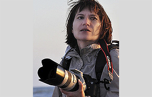 A left aligned
image. Lorem ipsum dolor sit amet, consectetuer adipiscing elit. Sed viverra tortor non dolor.
Donec nulla libero, ullamcorper sed, consequat dignissim, luctus blandit, sapien.
In ante. Proin aliquam odio ut sem. Lorem ipsum dolor sit amet, consectetuer adipiscing elit. Consequat dignissim,
luctus blandit, sapien. In ante. Proin aliquam odio ut sem consequat dignissim, luctus blandit, sapien.
In ante. Proin aliquam odio ut sem. Lorem ipsum dolor sit amet, consectetuer adipiscing elit.
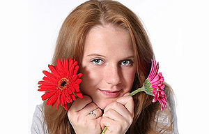
A left aligned
image. Lorem ipsum dolor sit amet, consectetuer adipiscing elit. Sed viverra tortor non dolor.
Donec nulla libero, ullamcorper sed, consequat dignissim, luctus blandit, sapien.
In ante. Proin aliquam odio ut sem. Lorem ipsum dolor sit amet, consectetuer adipiscing elit. Consequat dignissim,
luctus blandit, sapien. In ante. Proin aliquam odio ut sem consequat dignissim, luctus blandit, sapien.
In ante. Proin aliquam odio ut sem. Lorem ipsum dolor sit amet, consectetuer adipiscing elit.
 A right
aligned image. Lorem ipsum dolor sit amet,
consectetuer adipiscing elit. Sed viverra tortor non dolor. Donec nulla libero, ullamcorper sed, consequat
dignissim, luctus blandit, sapien.
In ante. Proin aliquam odio ut sem. Lorem ipsum dolor sit amet, consectetuer adipiscing elit.
A right
aligned image. Lorem ipsum dolor sit amet,
consectetuer adipiscing elit. Sed viverra tortor non dolor. Donec nulla libero, ullamcorper sed, consequat
dignissim, luctus blandit, sapien.
In ante. Proin aliquam odio ut sem. Lorem ipsum dolor sit amet, consectetuer adipiscing elit.
 A left
aligned, linked image. Lorem ipsum dolor sit amet, consectetuer adipiscing elit. Sed viverra tortor
non dolor. Donec nulla libero, ullamcorper sed, consequat dignissim, luctus
blandit, sapien. In ante. Proin aliquam odio ut sem. Lorem ipsum dolor sit amet, consectetuer adipiscing elit.
A left
aligned, linked image. Lorem ipsum dolor sit amet, consectetuer adipiscing elit. Sed viverra tortor
non dolor. Donec nulla libero, ullamcorper sed, consequat dignissim, luctus
blandit, sapien. In ante. Proin aliquam odio ut sem. Lorem ipsum dolor sit amet, consectetuer adipiscing elit.
These are some very basic tabs. There are some downsides with tabs in responsive layouts - in small screens they will stack over each other. Make sure to test how it looks like when you want to use them. Don´t use too long titles.
These are some very basic tabs. There are some downsides with tabs in responsive layouts - in small screens they will stack over each other. Make sure to test how it looks like when you want to use them. Don´t use too long titles.
These are some very basic tabs. There are some downsides with tabs in responsive layouts - in small screens they will stack over each other. Make sure to test how it looks like when you want to use them. Don´t use too long titles.
Data tables and forms don´t always play nice in responsive layouts. They can be flexible in width but to display cell content in a way that is readable and makes sense, they have to have a certain width. There are approaches in the web to deal with that, but that´s an own topic. Search for it if you are in need of larger tables or forms.
| Table header | Table header | Table header | Table header |
|---|---|---|---|
| Cell data | Cell data | Cell data | Cell data |
| Cell data | Cell data | Cell data | Cell data |
| Cell data | Cell data | Cell data | Cell data |
| Table header | Table header | Table header | |
|---|---|---|---|
| Cell data | Cell data | Cell data | Cell data |
| Cell data | Cell data | Cell data | Cell data |
| Cell data | Cell data | Cell data | Cell data |
To see a form, go here!
This template is responsive! It is based on the Inuit-framework. You can extend the framework with igloos - have a look at the website!
The grid used here has a max-width of 1120 px for larger screens and 16 columns with no end or last in use to stop the flow - self-clearing!
The slider is the fantastic responsive Flexslider, which offers many features. Visit the website to find out more about the functions and features!
The social icons were made by Alex Peattie, you can download the set on his website and even use them as a webfont with @font-face!